As a professional in the streaming world, chances are you review your profile and manage your streams mainly from your laptop or desktop. You’ve likely designed your profile using a sizeable monitor, ensuring every graphic and element is perfectly positioned. You’re confident that when your viewers visit your profile, they see precisely what you intended.
However, you might be surprised to learn this isn’t the case for a vast majority of your viewers.
Contrary to what you may think, about 70% of your viewers aren’t accessing your profile from a large desktop screen. Instead, they’re scrolling through your profile from the small, narrow screen of a mobile device. So, that perfect profile design you created on your laptop? It might not look so perfect on a mobile device. In fact, it could look disorganized and hard to navigate, potentially costing you in viewer engagement and tips.
This is a common pitfall for streamers when establishing their online presence. But, the good news is that it’s preventable and fixable with a proper understanding of why it happens and how to design with a mobile-first mentality.
The prevalence of mobile viewing in live streaming is often underestimated. Data from most analytics platforms, including Chaturbate, indicate that approximately 70% of traffic originates from mobile devices. So, for every 100 people viewing your profile, around 70 of them are doing so from a phone or tablet.
This disparity between how streamers build their content and how viewers consume it is significant. The vast majority of streamers – around 99% – stream from a laptop or desktop. This is understandable as larger screens and better hardware make managing broadcasts easier. However, it creates a blind spot that could be detrimental.
When streamers review their profiles on a wide screen, they are seeing a completely different version than most of their audience. Imagine designing a poster for a billboard, then discovering most people are viewing it on a business card.
Certain elements that look great on your laptop may not translate properly to a mobile screen. For instance, graphics may become illegible, important buttons may be pushed down the page, or text that seemed compact on your laptop may now seem like a daunting wall of words.
You must be aware that your audience’s habits should dictate your design decisions. It’s important to remember that mobile viewers are often:
1. Multitasking or on the move
2. Viewing your profile in short bursts
3. Making quick decisions about who to follow, subscribe to, or tip
Consequently, your mobile layout must be clear and appealing within seconds. A poorly optimized mobile profile could result in lost followers, diminished tips, and fewer long-term fans.
Before making any design changes, you need to see your profile from your viewers’ perspective. This can be achieved by reviewing it on different mobile devices or using online tools that simulate various screen sizes.
Creating a profile that functions well on both mobile and desktop can be challenging, especially since streaming platforms were not originally designed with advanced responsive design in mind. They only offer a limited set of customization tools, which can make it difficult to balance visual appeal and usability across different devices.
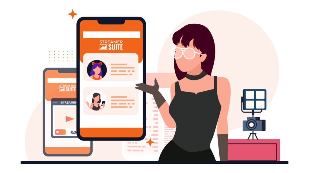
This is where StreamerSuite’s profile design service can be of immense help. Every theme we create is fully responsive, automatically adapting to the viewer’s screen size. Whether your viewers are using a desktop monitor, a laptop, a tablet, or a mobile phone, our layouts are optimized for clarity and impact.
We design with a mobile-first mindset, ensuring that your profile not only looks good on your laptop, but also caters to the 70% of your audience visiting from a phone. This difference can have a direct impact on your engagement, tips, and overall fan growth.
To see exactly how our themes tackle this challenge, take a look at our mobile optimized profile designs and compare them to your current setup. The difference will be evident.
A mobile-optimized profile doesn’t just offer visual appeal, it also enhances the way people interact with your content, leading to increased engagement and revenue.
To maintain a mobile-friendly profile, avoid common mistakes like creating large, detailed graphics, using small text, or placing important elements too far down the page. StreamerSuite’s themes are designed to automatically avoid these pitfalls, but if you’re customizing your own profile, they are crucial points to keep in mind.
Remember, a mobile-friendly design isn’t a set-it-and-forget-it solution. As platforms change their layouts, as you add new content, and as your audience’s device preferences shift over time, it’s important to consistently check your profile and make necessary adjustments.
If you’ve been designing your profile from a laptop or desktop perspective, it’s time to switch gears and start thinking mobile-first. With StreamerSuite’s mobile-optimized themes, you can be assured that your profile will look and function perfectly on both mobile and desktop. This allows you to focus on streaming, knowing that your brand is consistently making the right impression.
While your laptop may be your creative hub, your mobile viewers are your growth engine. Prioritize them by ensuring your profile is as appealing and navigable on a mobile device as it is on a desktop.